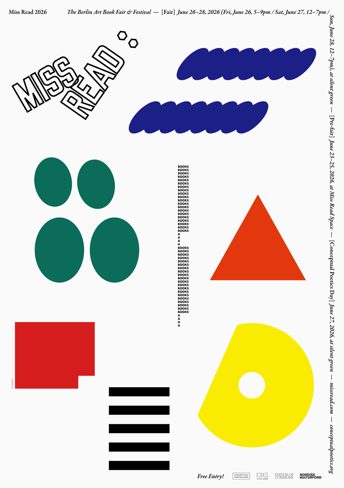
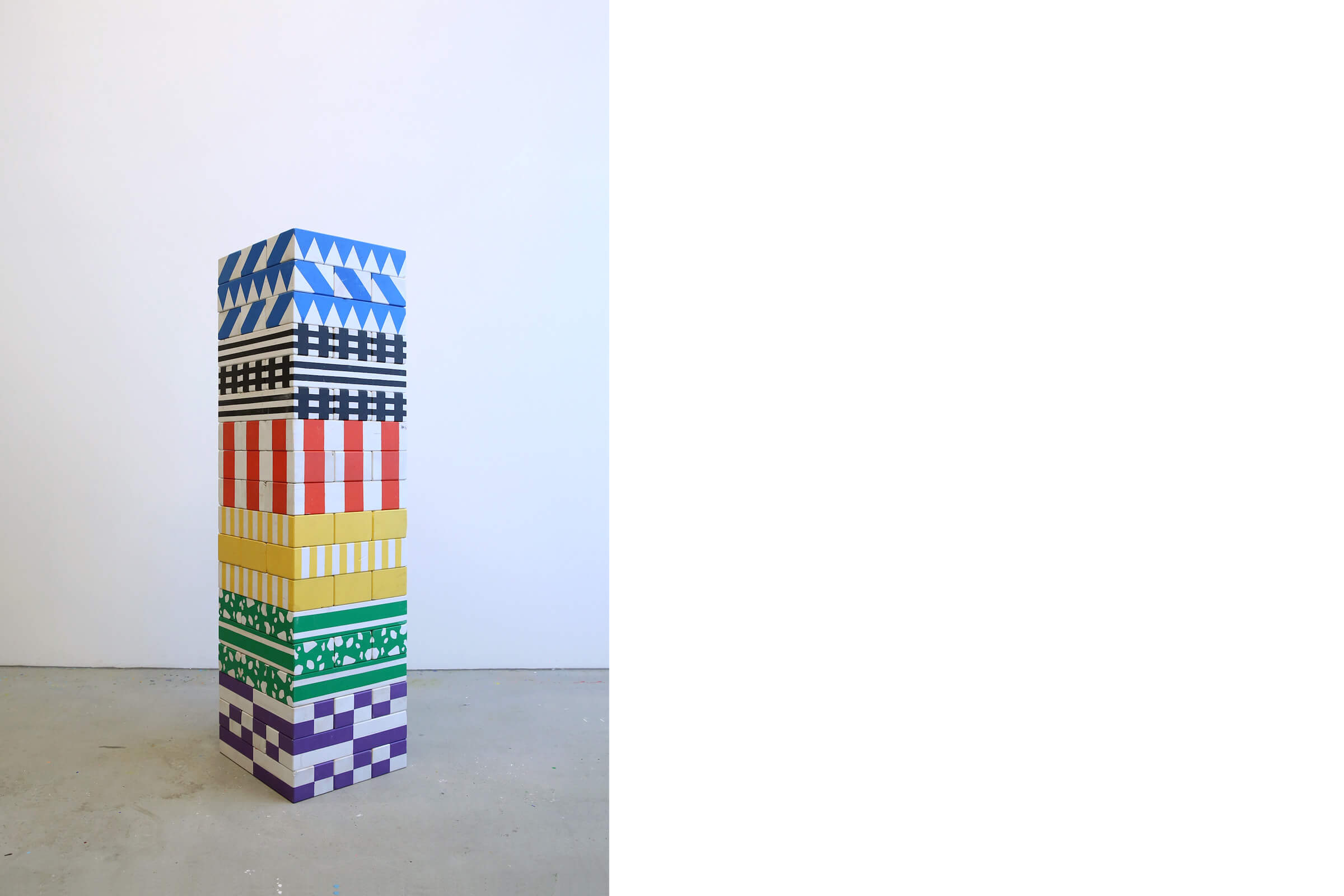
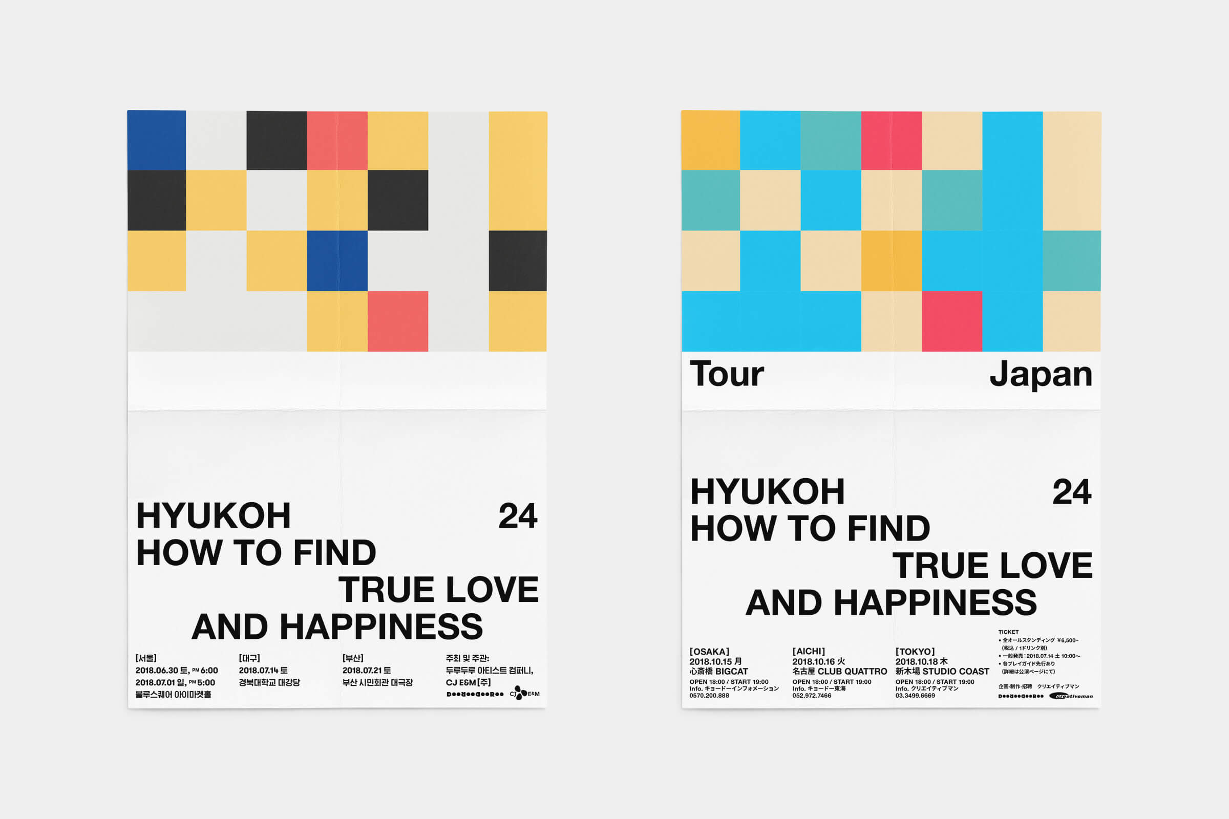
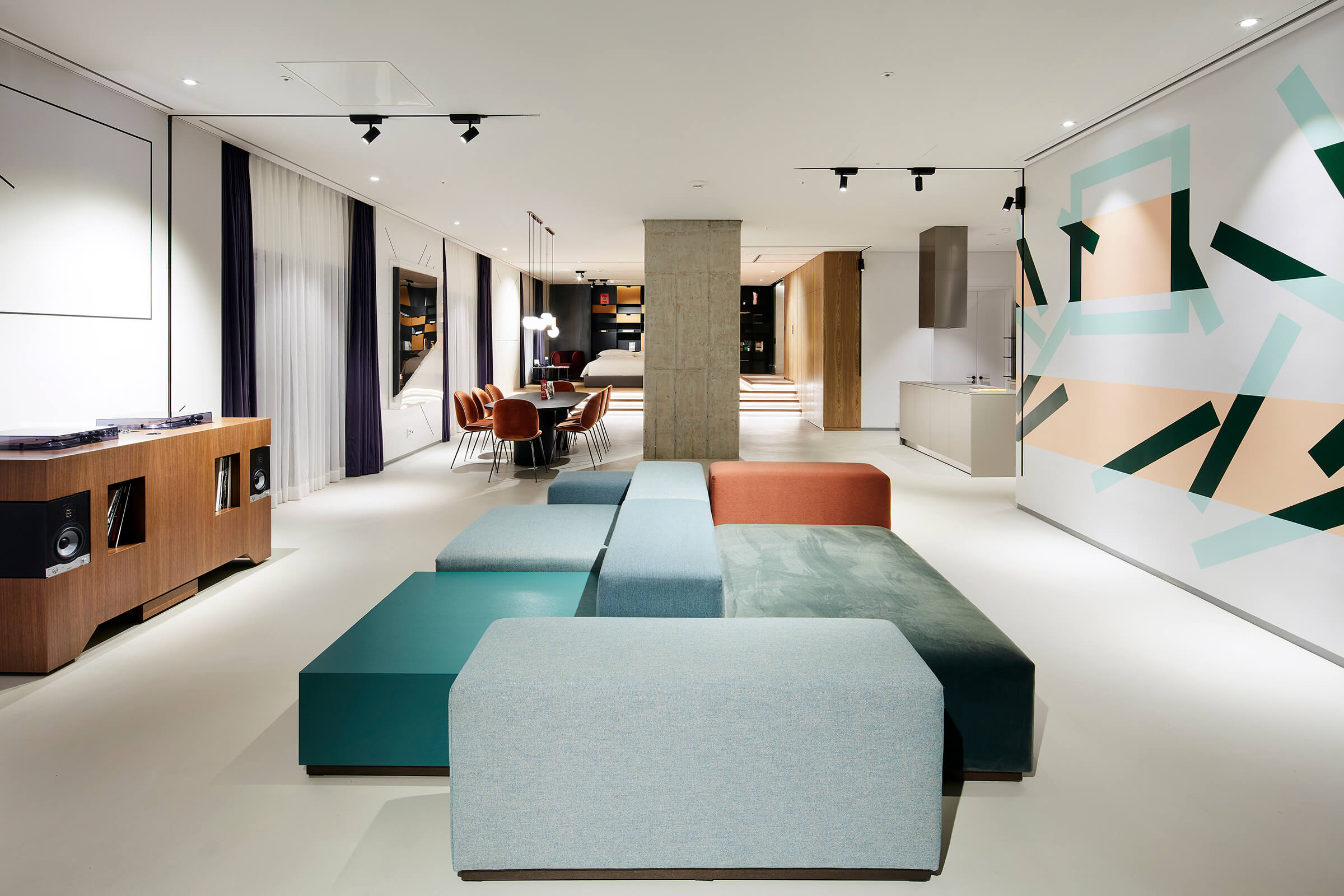
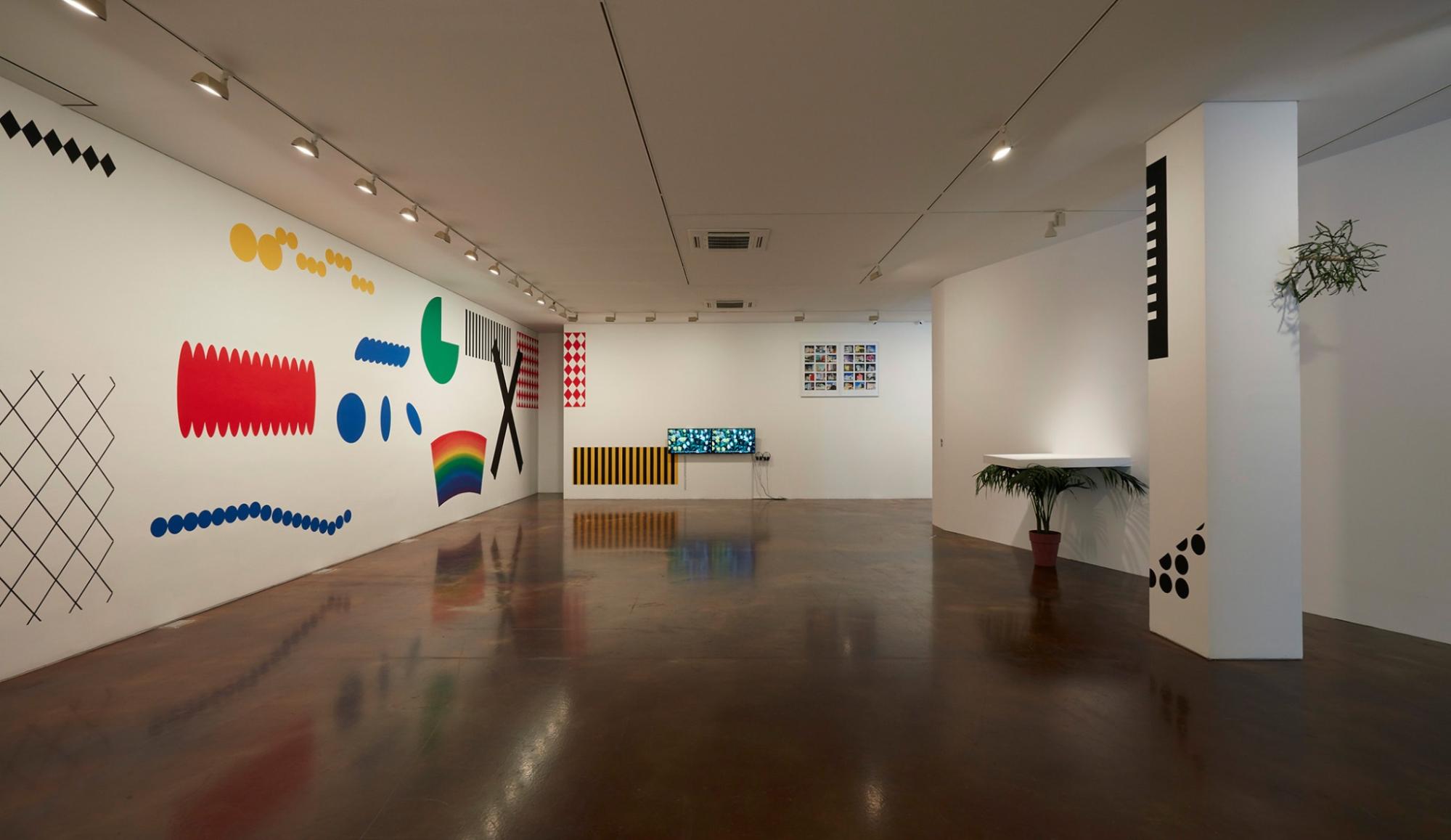
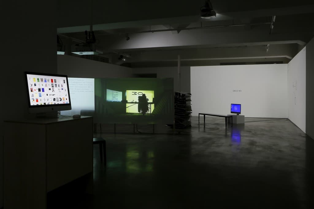
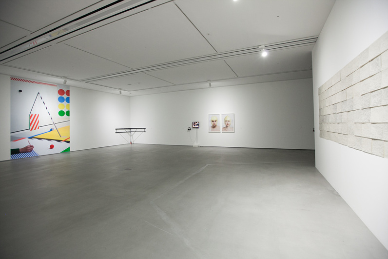
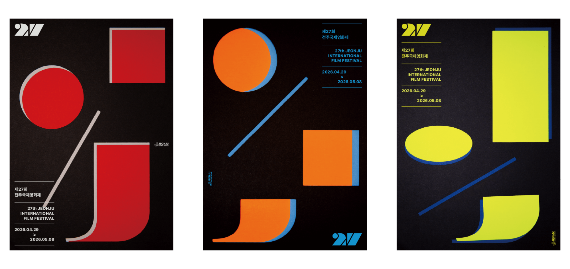
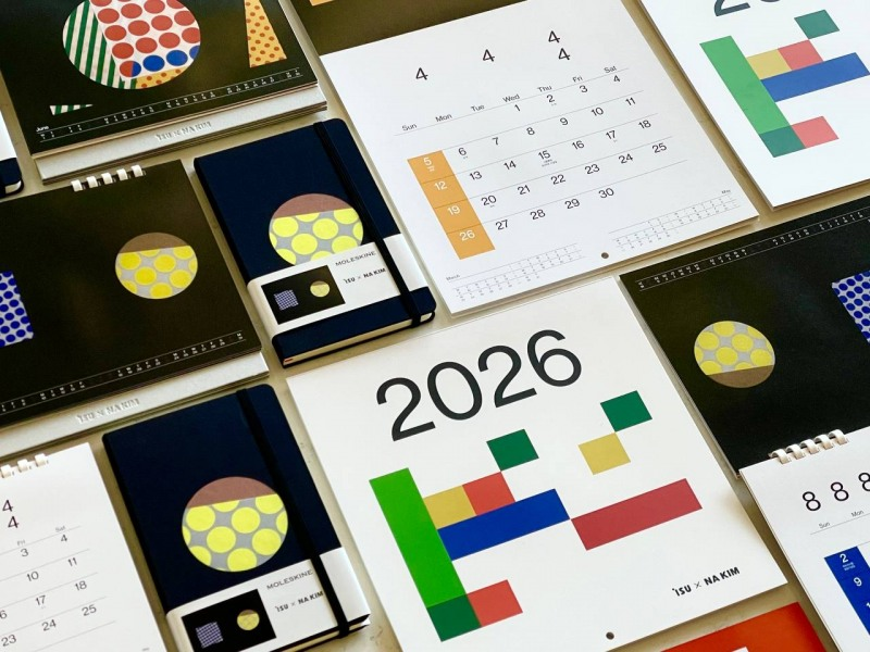
Na Kim's visual language is built around fundamental elements of graphic design, including color, geometric shapes, typography, patterns, and symbols. She extracts and categorizes visual forms encountered in everyday life, creating distinctive compositions through new combinations and arrangements.
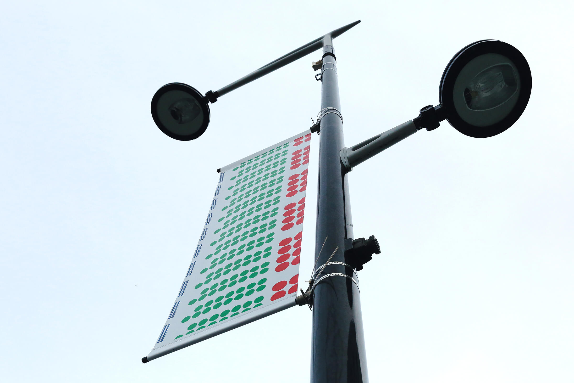
Her work is characterized by bold primary colors, clearly defined forms, and repetitive patterns, while principles of alignment, proportion, and repetition derived from printing and editorial design inform her formal approach. These compositions expand from the printed page into murals, paintings, sculptures, and spatial installations, producing different visual effects according to their media. Throughout this process, the designer's decisions regarding selection and arrangement remain central to the transformation of individual images.
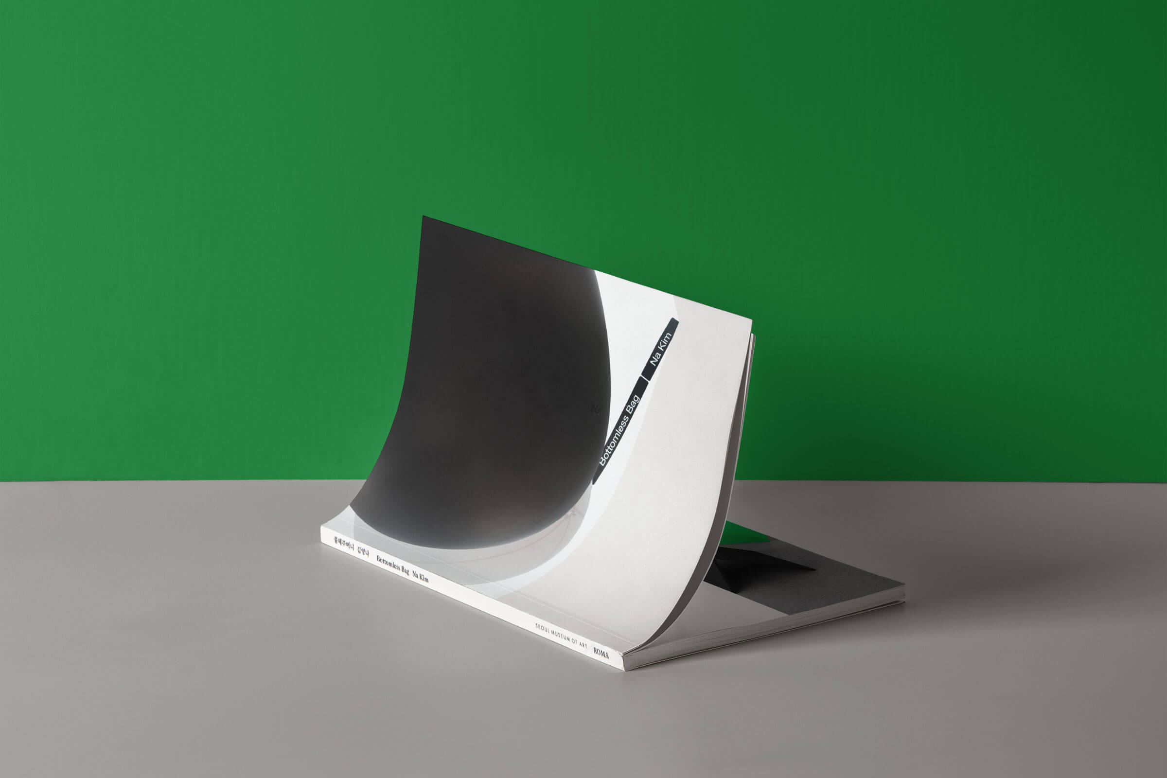
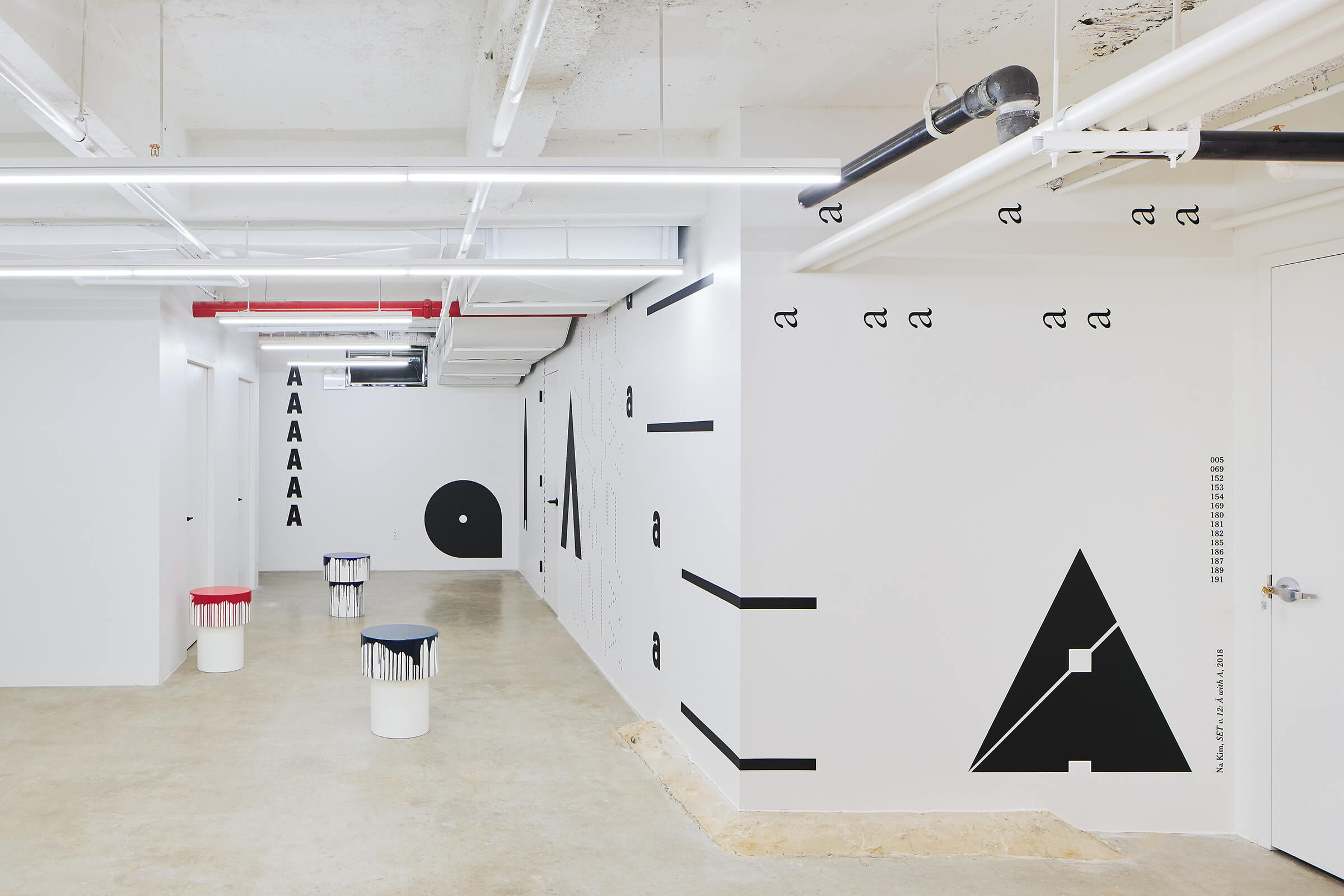
Her representative ‘SET’ series demonstrates how design methodologies can be translated into artistic forms. Kim created the sample book SET (2015) by extracting colors and geometric elements from design projects produced between 2006 and 2015, removing their original functions and content, and reorganizing them into categories.
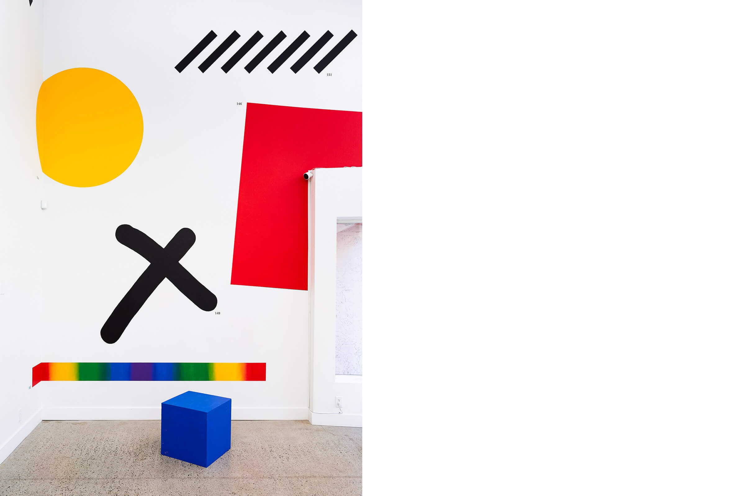
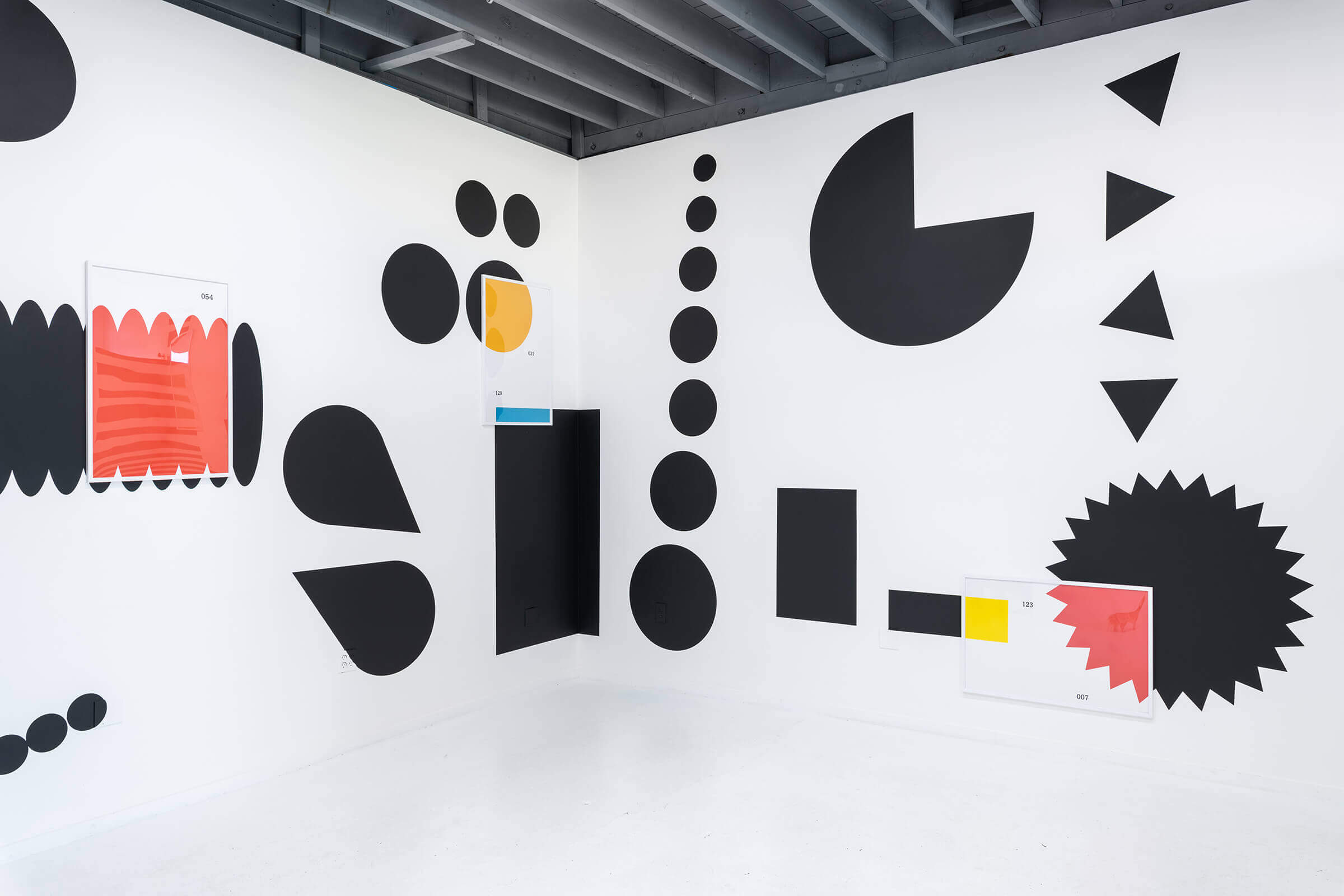
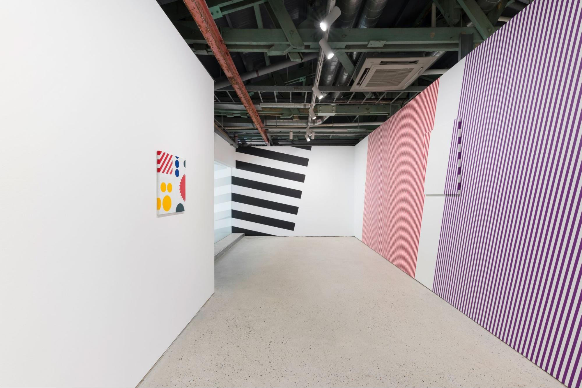
She subsequently developed the material into a series of murals, enlarging and rearranging the book's pages across exhibition walls according to different spatial conditions. In SET v.24 (2023), she emphasized repetition and visual rhythm across a wall spanning more than 16 meters, while SET v.25: View N (2024) introduced new compositions through altered proportions. The related ‘Piece’ series transfers selected sections of these murals onto canvas, examining the formal characteristics that emerge as images move between the printed page, architectural space, and the painted surface.
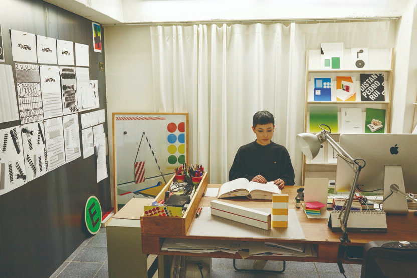
The ongoing ‘Found Composition’ series, initiated in 2009, reveals Kim's process of directly handling and combining collected materials. Working primarily on A4- and A5-sized paper, she constructs improvised compositions by attaching, detaching, and cutting everyday printed materials such as stickers, wrapping paper, envelopes, and magazines. These works function both as preparatory sketches for design projects and as independent artworks, engaging with the physical qualities of collected materials and the possibilities of unexpected arrangements.
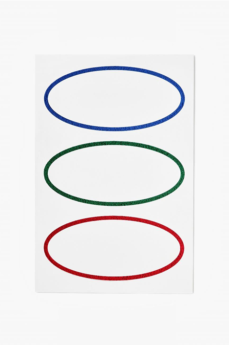
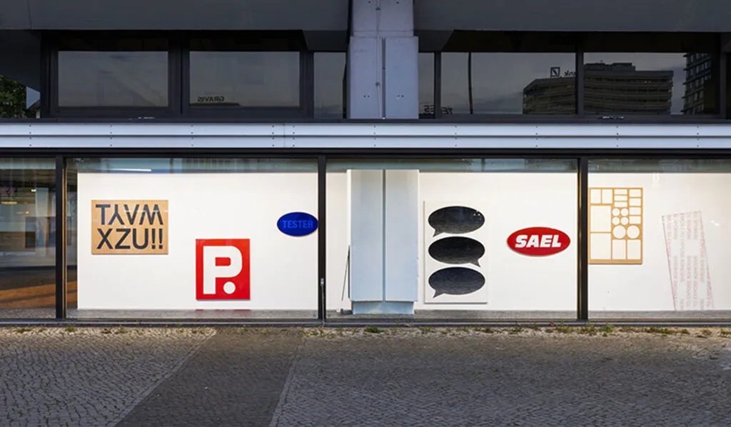
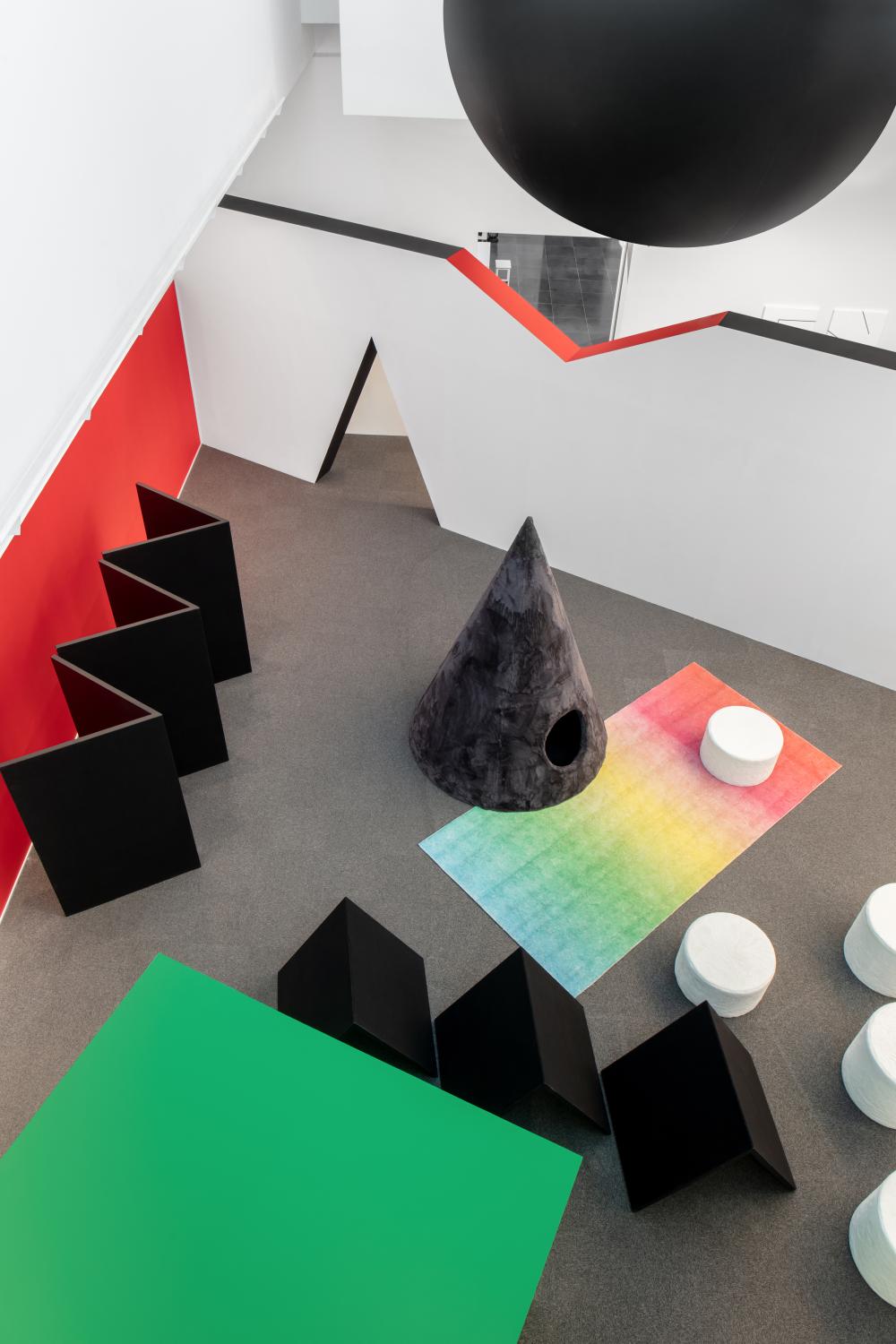
In 《TESTER》 (2023) and 《Easy Heavy》 (2024), these interests expanded into paintings and objects employing diverse materials. Works such as Final Notice (2023), which renders an urgent payment notice in soft wool, and OP.QUS·TRVWX·Y·Z (2024), which pictorially represents the spaces left after letters are removed from sticker sheets, reveal the sensory discrepancies that emerge between text, image, and material.
Architectural features and the movements of viewers also serve as essential formal elements in Kim's practice. She observes the columns, walls, heights, and circulation routes of exhibition spaces, incorporating their existing conditions into the organizational principles of her work. Presented in 《Easy Heavy》, H1276 (2024) extends across the gallery walls at a height of 127.6 centimeters, corresponding to an existing architectural structure, allowing a spatial measurement to determine the arrangement and installation of the work.
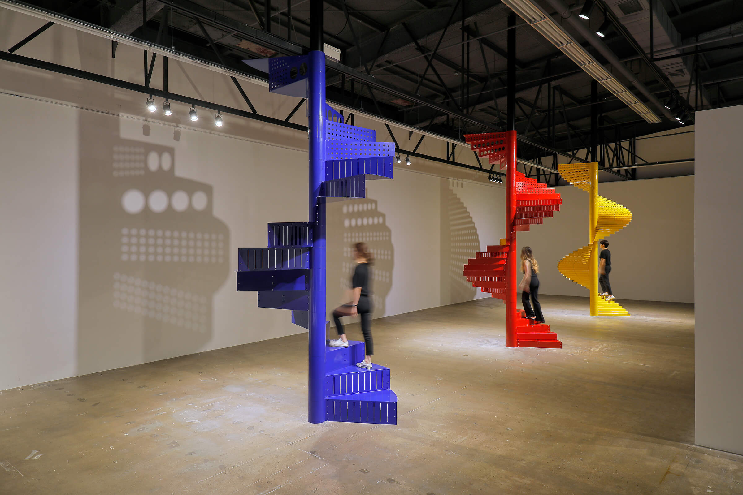
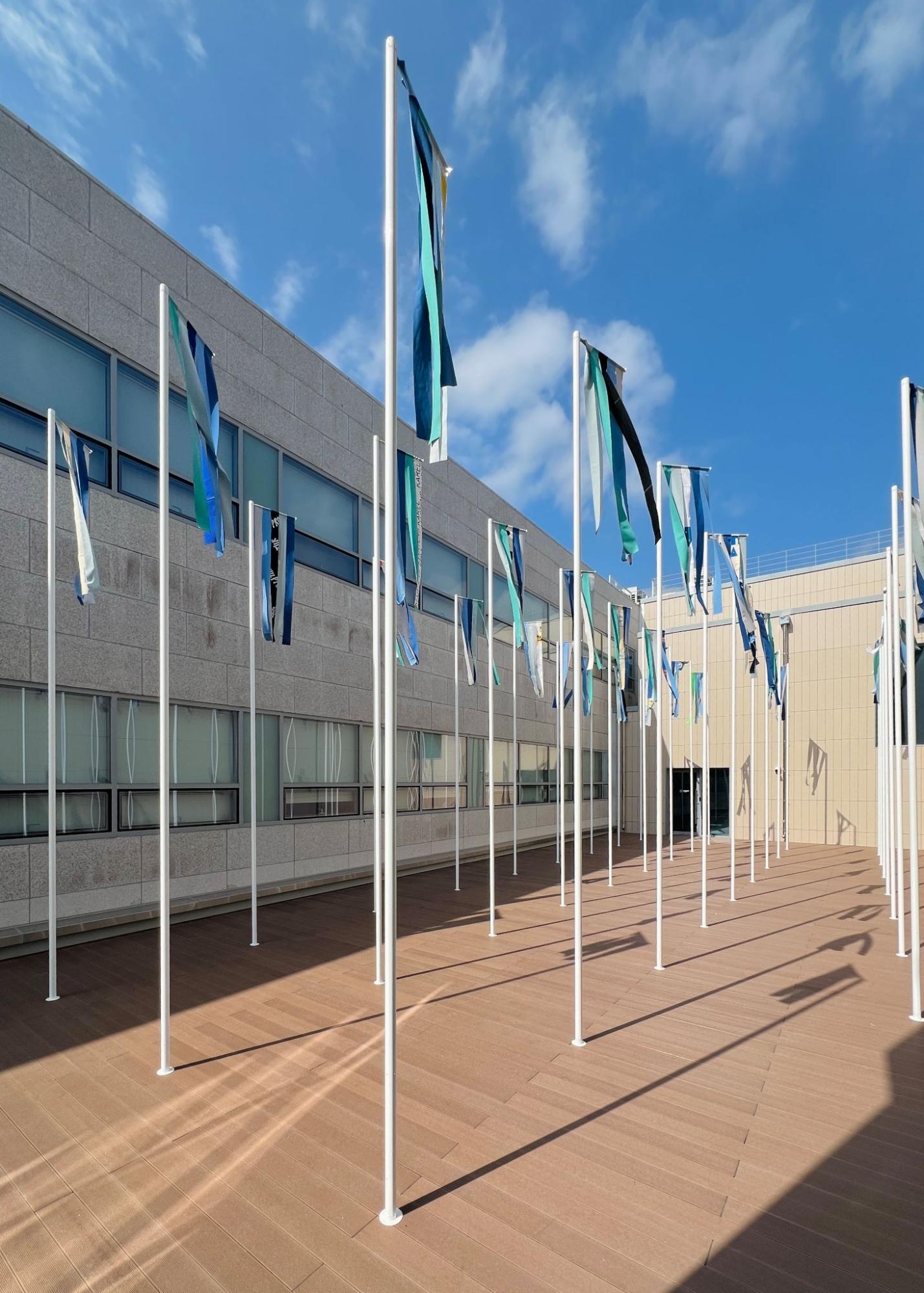
This approach developed in a more sensory direction in her 2026 solo exhibition 《Oblique Time》 at KAIST Art Museum. Three installations incorporating rooftop columns, stairs, and a mirror placed on the ground invite visitors to experience the wind, sky, and their own reflections through walking, climbing, and shifting perspectives. By allowing the form of the work to unfold through bodily experience and changes in the surrounding environment, Kim continues to explore new possibilities for artistic media.